- Pronouns
- she/her
- Twitch
- zaytri
- YouTube
- imZaytri
- TikTok
- imZaytri
- imZaytri
- Website
- https://zaytri.com/
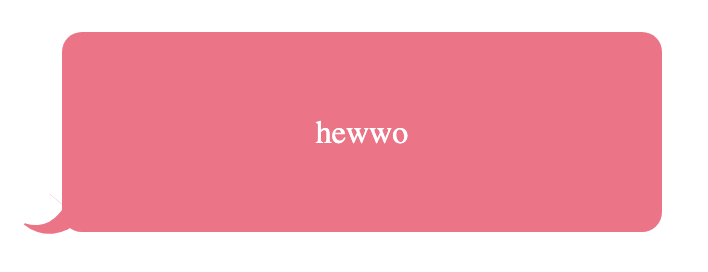
Wanna learn how to make this in CSS?

It involves a trick using
Here's a JSFiddle with all the code for you to mess around with (make sure to click the Run button on the top left to see your changes)
This is how it works:
This works with any background, including transparent, since no background color was ever given to #tail!
By giving #tail

Bonus: Opacity
If you set the background color of the box and tail to be semi-transparent, you get an overlap at the bottom left, like this:

To avoid that, just set an opacity value on the #box itself, like

This will make everything in the box semi-transparent, including the text, but you can get around by having the background and the text be on separate layers within another div.

It involves a trick using
box-shadow.Here's a JSFiddle with all the code for you to mess around with (make sure to click the Run button on the top left to see your changes)
This is how it works:
- Make sure your main box has
position: relative, so that anything absolute positioned within there will be positioned relative to the box rather than the entire window. - Create a tail div within that box, use
position: absoluteon it + negative values forbottomandleftto extend it beyond the bottom left corner of the box. - Give that #tail a
height,width,border-bottom-right-radius,overflow: hidden(necessary for the trick), and some rotation withtransform: rotate. - Notice how we don't give the tail div a background color, because we're actually just using it to define the bounds for the tail (which is why we need
overflow: hiddento clip the contents to the border radius. - Define the pseudo-element
#tail::after, giving it acontent: ''(otherwise the pseudo-element won't display anything). - Give #tail::after
position: absolute, negativeleft(important to create the tail point),bottom: 0. - Give #tail::after a
height,width, and the sameborder-bottom-right-radiusas the tail div. - Now for the magic: add
box-shadow: 0 0 0 10px colorto tail::after, replacing color with whatever color the box is. This spreads the box shadow by 10px in all directions, which just fills in the space between#tail::afterand#tail, creating the tail.
This works with any background, including transparent, since no background color was ever given to #tail!
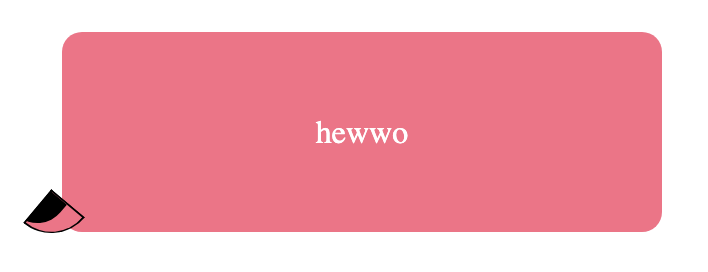
By giving #tail
background-color: black and border: 1px solid black, you can see how this illusion is pulled off.
Bonus: Opacity
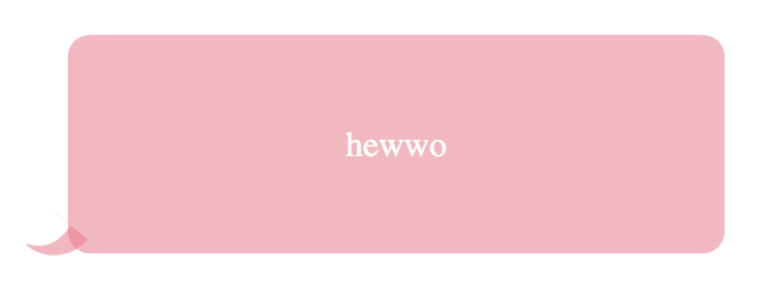
If you set the background color of the box and tail to be semi-transparent, you get an overlap at the bottom left, like this:

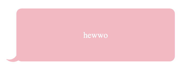
To avoid that, just set an opacity value on the #box itself, like
opacity: 0.5
This will make everything in the box semi-transparent, including the text, but you can get around by having the background and the text be on separate layers within another div.
